Brand Guidelines | Finzzy
Category
Branding · Guidelines
Company
Finzzy
Role
Product Designer · UX/UI Designer
Duration
6 days
Team
Product Designer, UX/UI Designer
Platform
Brand identity
Problem
Create a brand system for a fintech product that feels trustworthy and close, works for a broad audience with different levels of financial literacy, and holds up across many screens and states of the app —while meeting accessibility standards and staying flexible enough to evolve with the product.
Solution
Style guide built for the Finzzy personal finance app, aimed at the Colombian market where ~70% of the population struggles to save and manage their finances.
Result
Complete visual system for Finzzy: design principles, logo, safe zone, color palette and text usage rules.
Context & problem
Brand Guidelines for Finzzy: a style guide that documents the logo, safe zone, color palette and text usage rules for the personal finance app, ensuring a coherent, accessible and recognizable visual identity.
Business Context
Finzzy is a personal finance app designed for the Colombian market, where a large share of the population has difficulty saving and managing money. In that context, the brand needs to convey trust, clarity and closeness. These guidelines translate those values into concrete design decisions —simplicity, inclusion and flexibility— so every screen and touchpoint feels consistent and easy to understand.
My Role
As Product Designer and UX/UI Designer I defined and documented Finzzy's visual system: design criteria, logo, safe zone, color palette (Foreground and Accents 1–3) and text color rules to guarantee readability and AA compliance across the product.
Responsibilities
- Definition of design criteria: simple, inclusive and flexible.
- Logo design and construction, including safe zone and clear space rules.
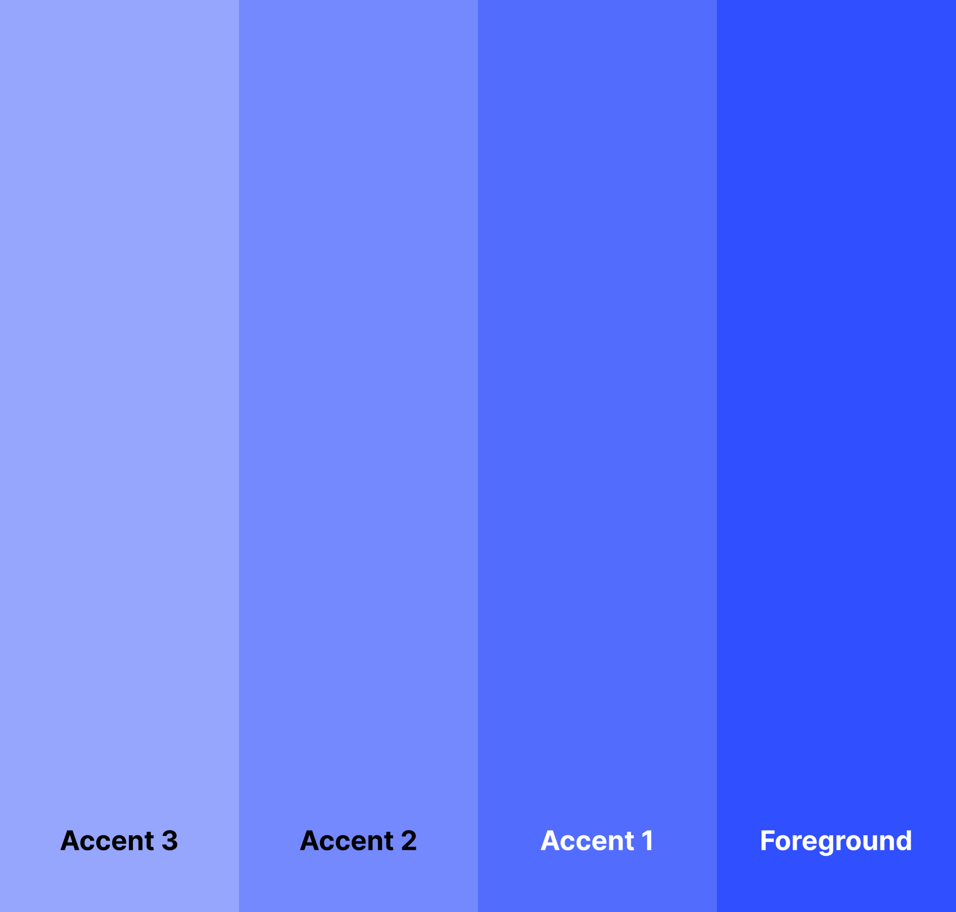
- Brand color palette: Foreground and Accents 1, 2 and 3 with RGB and HEX values.
- Text color rules to ensure legibility and AA contrast compliance.
- Documentation of the guidelines to scale the visual system across the app.
Challenge
Create a brand system for a fintech product that feels trustworthy and close, works for a broad audience with different levels of financial literacy, and holds up across many screens and states of the app —while meeting accessibility standards and staying flexible enough to evolve with the product.
Research & insights
Process & key decisions
- Brand discovery: distilled Finzzy's value proposition — reduce financial stress and improve economic stability — into three design principles: simple, inclusive and flexible.
- Logo construction: designed the mark, defined clear space / safe zone rules and documented minimum sizes for digital use.
- Color system: built a structured palette with foreground, accent and semantic colors, documented in RGB and HEX for engineering handoff.
- Accessibility rules: established text-color combinations and contrast checks to guarantee AA readability across light and dark UI states.
- Documentation: packaged the principles, logo, color palette and text usage rules into a shareable guidelines document for designers and developers.
Solution


Product Impact
- Style guide built for the Finzzy personal finance app, aimed at the Colombian market where ~70% of the population struggles to save and manage their finances.
- Defines a consistent visual system (logo, safe zone, color palette and text usage) that supports a simple, accessible experience across the app.
- Provides the visual foundation to reduce financial stress and reinforce trust through a clear, coherent and recognizable brand.
Leadership Highlights
- Defined the brand's design principles: simple, inclusive and flexible, aligned with AA accessibility standards.
- Built a scalable visual system: logo construction, safe zone, accent color scale and text color rules.
- Owned the guidelines end-to-end so the Finzzy app could grow with a consistent identity across screens and touchpoints.
Results & learnings
- Complete visual system for Finzzy: design principles, logo, safe zone, color palette and text usage rules.
- Guidelines aligned with AA accessibility and contrast standards.
- Reusable foundation to keep the app's identity consistent as new screens and features are added.